
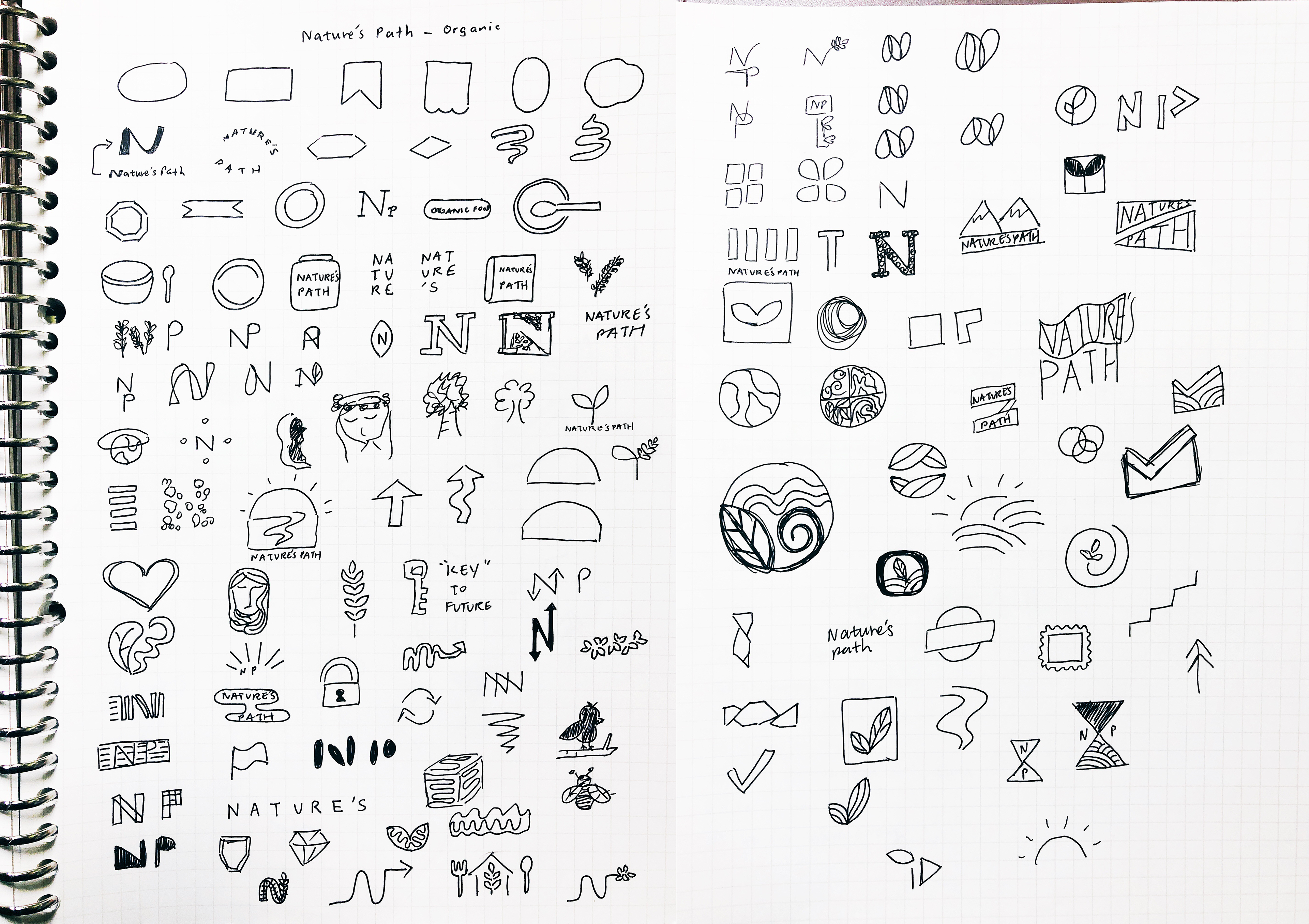
PROBLEM
Nature’s Path is already positioned well as a highly established brand of organic food products but need a rebrand to refresh and highlight their brand personality better - instead of the generic "field of wheat" product logo. Due to the large breadth of products they sell, there is a challenge in creating a rebrand that can be applied effortlessly in various types of marketing materials. this is the main challenge as there are different sub-brands within Natures Path.

OPPORTUNITY AND STRATEGY
Due to the large presence of Nature's Path in both regular and specialty stores, the brand has an opportunity to invest more resources in showing consumers their values and lifestyle through the new identity.
VISUAL IDENTITY
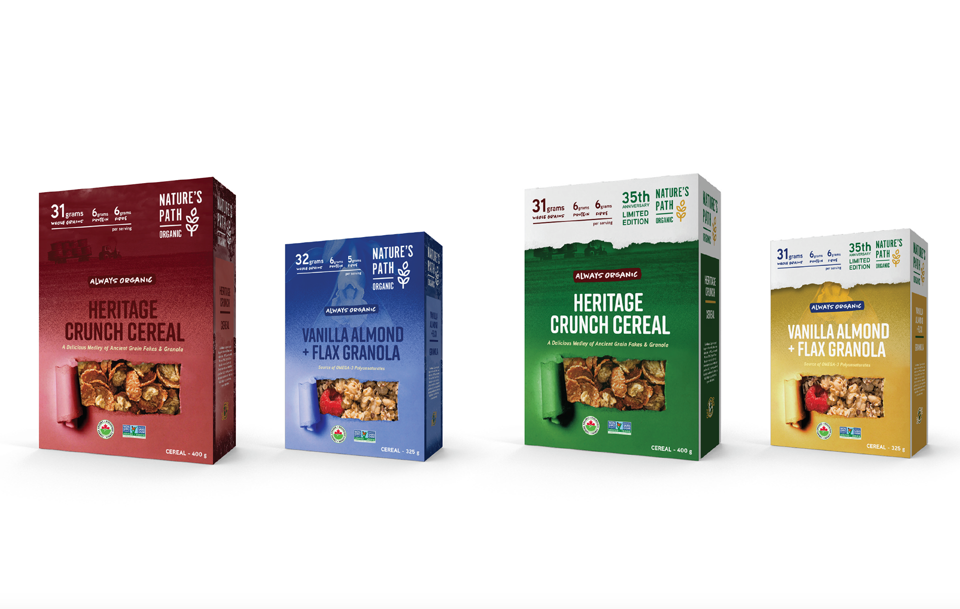
The new rebranded logo conveys the authority and influence of Nature’s Path in the organic food products sector. It is structured within a grid system; a “mark” or “stamp” of quality. The slight curve of the wheat icon gives natural movement (like nature) adds personality to the mark. The use of the sans serif, Alternate Gothic No 10 and its similar line thickness to the strokes of the wheat gives an overall sense of cohesion. The logo is strong, bold and a modern take for a brand who pioneered the organic food products movement.
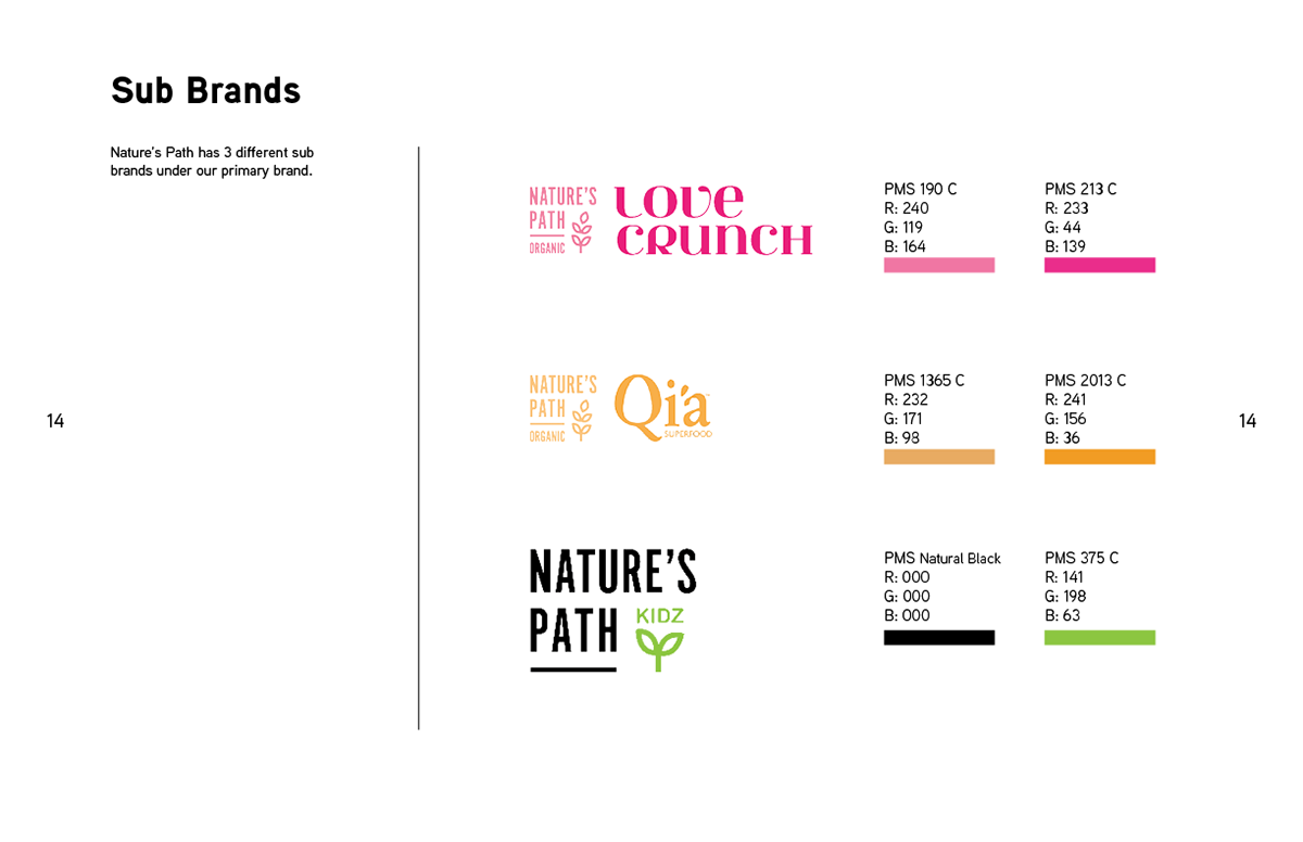
For brand consistency, the sub brand identities were adjusted and are required to be accompanied with the Nature’s Path primary logo. Nature’s Path Enivro-Kidz received a more detailed rebrand to match the new primary identity.